
Branding a Precinct with brewing history
Head On was nominated by local traders and engaged by the City of Yarra to name, brand, and launch a new digital identity for Richmond and Abbotsford’s overlooked precinct. The Brewers End captures the area’s history, energy, and brewing heritage, turning a struggling zone into a destination with pride, character, and presence.
The task was to create a compelling name and visual identity that honoured the area’s brewing heritage while injecting fresh energy into a modern community hub. The brand needed to resonate with locals, attract visitors, and reflect the eclectic, connected spirit of Richmond and Abbotsford.
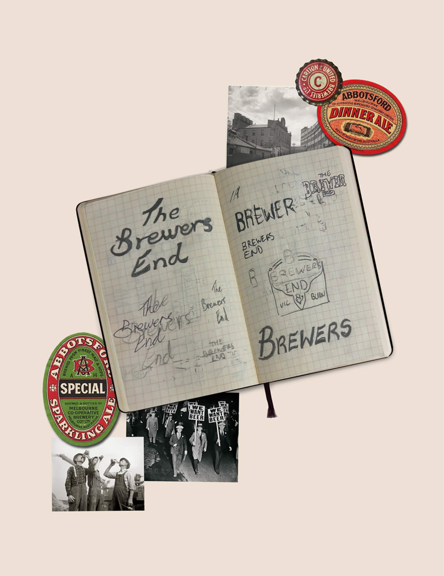

We started with research into the area’s long history as a cornerstone of Australian brewing. The name The Brewers End emerged as a nod to this legacy and a statement of pride for the precinct.
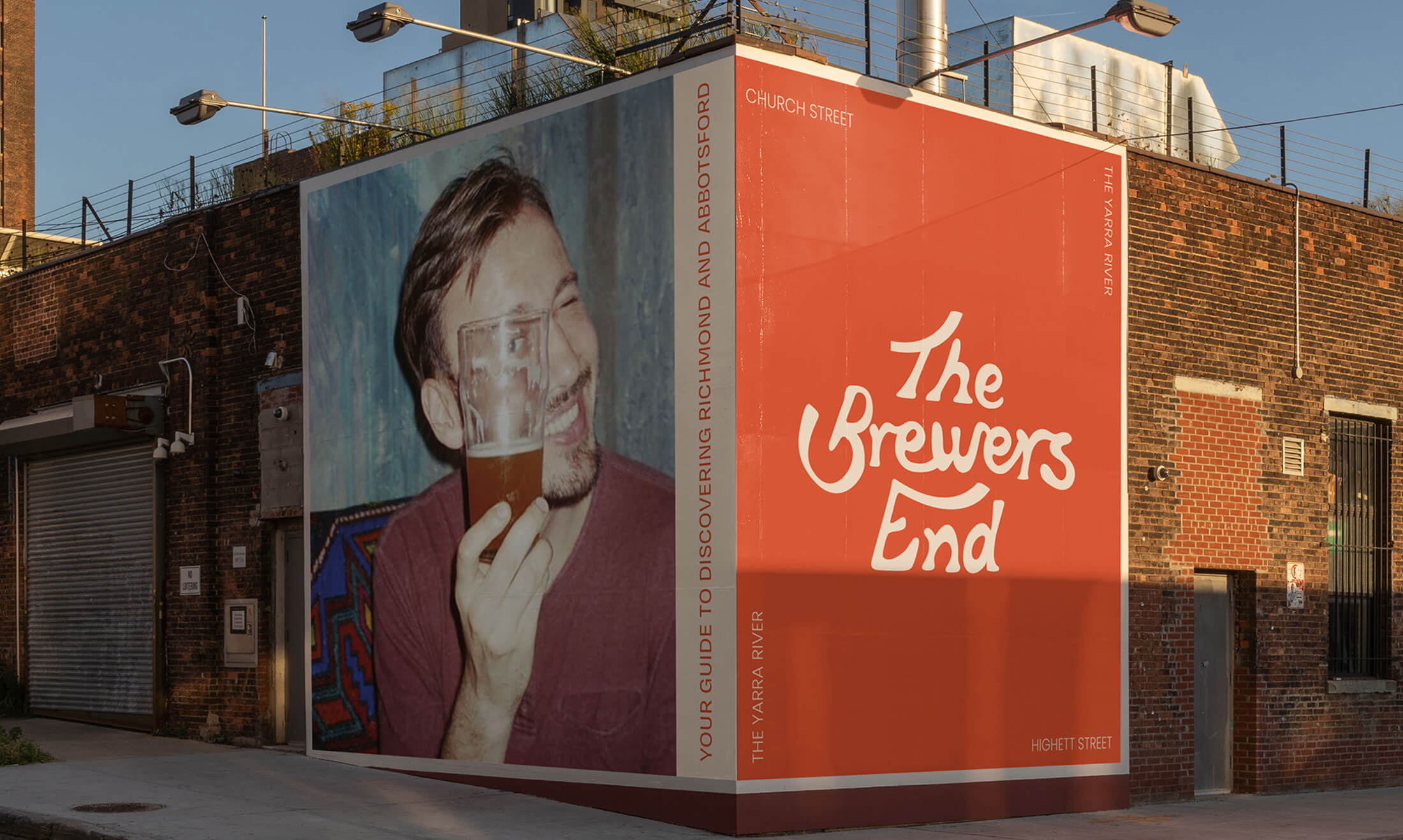
Visually, the brand leans into nostalgia with a handcrafted logotype inspired by vintage signage and beer labels. Ligatures and upward curves in the typography add a sense of movement and optimism. The colour palette balances warm, heritage tones with bright pops of energy, echoing the suburb’s personality: a little old-school, a little new wave.
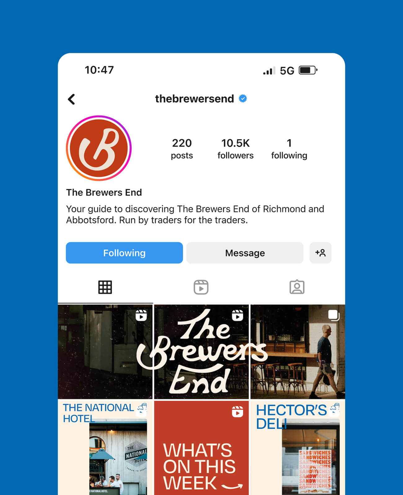
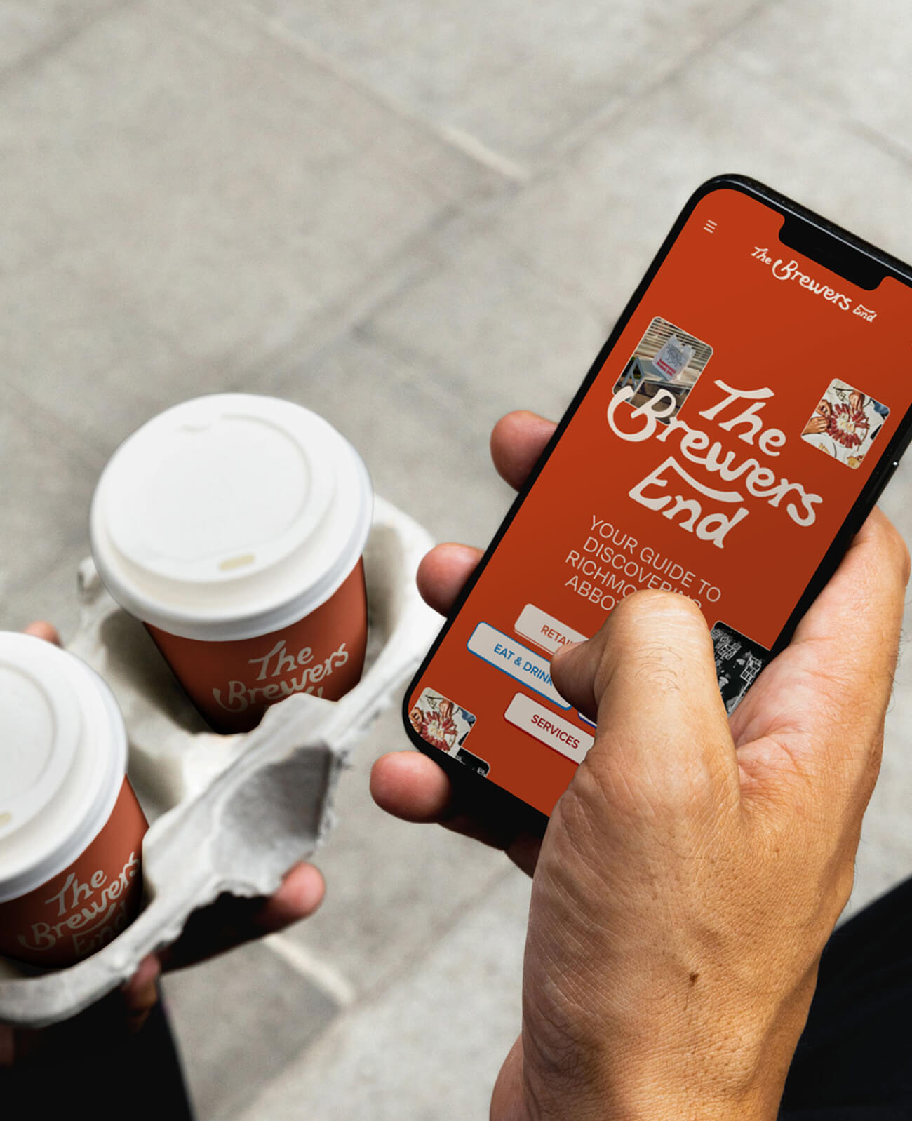
This visual identity was then rolled out across digital and physical touchpoints, from website and social media through to signage and print collateral, ensuring consistency and memorability.
The Brewers End now stands as a distinctive and memorable brand rooted in place. Playful yet polished, familiar yet fresh, the identity is more than a logo - it’s a unifying mark of pride for traders, residents, and visitors. The branding has helped the precinct gain visibility, spark community engagement, and celebrate Richmond/Abbotsford's culture and heritage in a way that feels both authentic and modern.

Discover more projects.
K18 - Shopify Plus Website
Tell Me More - Podcast